Context:
I wanted to work on this piece in order to provide context for the economic slowdown that was occurring before COVID-19 ever occurred. While the virus and the subsequent shutdown of the US economy are why we had such a poor Q/Q Q2 GDP number (-32.9%!), it would be wrong to assume that this downturn was not at a high likelihood of taking place. I will structure this piece by going over all the signs that pointed to the US economic downturn.
Key Words: rate of change
US GDP Curve:
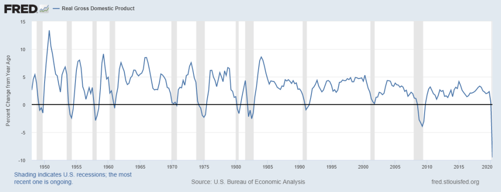
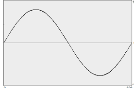
In order to better understand global macro, one must understand the rate of change for factors such as economic growth. While the GDP curve does not perfectly mirror a sine curve, they undoubtedly share similarities, including the importance of rate of change. By studying and mapping the rate of change, we are able to gain insight on possible inflection points that inform us on the upcoming economic environment, e.g., recovery, expansion, recession, etc. In addition, I include the year/year (Y/Y) growth of GDP because it provides a more holistic and long-term view of US economic growth.
As an example of the cyclical nature of economic growth, we simply need to observe the image above. Before the recession dates, which are shaded in grey, there was ALWAYS a downwards sloping GDP curve (to varying degrees, but that is besides the point).
With that being said, as the data suggests, the cycle peaked in Q2 of 2018 on a Y/Y basis, and was trending down afterwards. Although this did not guarantee a recession, as seen with the peak in Q1 of 2015, it certainly raises the probability that such an economic environment occurs.
US Yields:
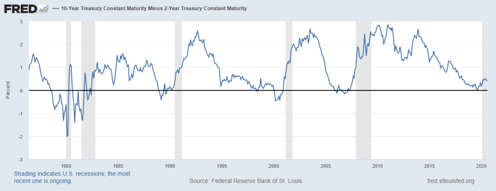
The Yield Curve (UST 10 Yr – UST 2 Yr) is an important figure to keep track off, as it provides great insight from investors to the state of the overall economy. As many of us have been taught in school, when the curve inverts, or in this example becomes negative, it becomes a sign that the probability has risen tremendously for an economic downturn. When the curve enters negative territory, it signals that investors are piling into the 10 Yr yield as opposed to its 2 Yr counterpart, and thus showing less confidence in the shorter term for the economy.
In the latest cycle, we have seen a steady downwards trend since 2014, and the curve itself briefly inverted in March of 2019. While COVID-19 came out of nowhere, and made the economic downturn worse than it otherwise would have been, it would be unwise to not look at such a timeless indicator.
Corporate Debt:
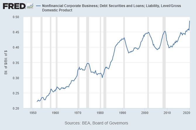
The image above demonstrates the upwards trend of corporate debt/GDP that the US has utilized in the past seventy years. Undoubtedly, it appears that the American economy has grown more dependent on leverage than ever before. Without going too much into detail, it is an undeniable fact that we had reached an all-time high in corporate leverage relative to GDP pre-COVID. Such high levels of leverage raise the chances of defaults, which then accumulate and create a detriment to the economy.
Global Trade Volume:
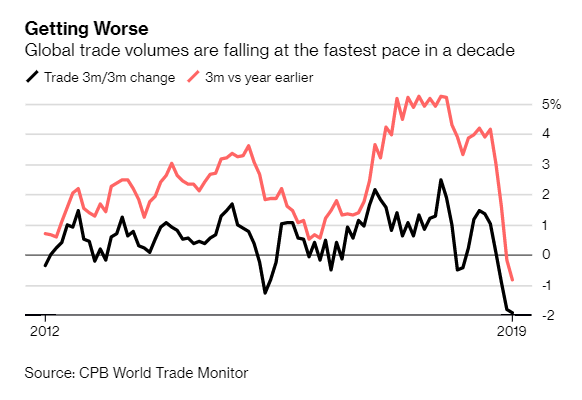
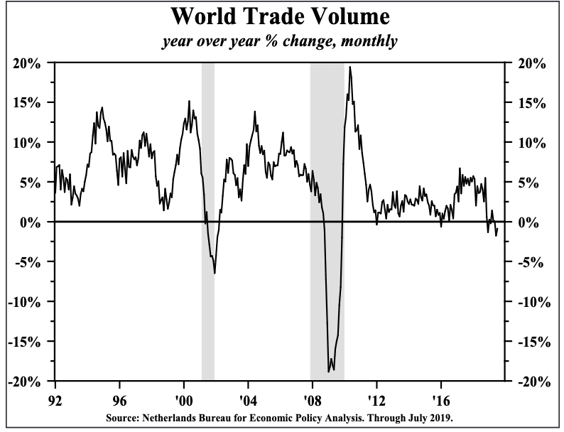
As mentioned in this article, (https://ourworldindata.org/trade-and-globalization), the sum of exports and imports is equivalent to over half of the world’s output. In other words, in our very globalized economy, looking at the volume of trade across the world is an important thing to look at. And like with the other topics in this piece, looking at the absolute values of it all provides minimal value in comparison to the rate of change of growth. While it was certainly exacerbated by the Trade War between the United States and China, trade had already been slowing. Combine the two, and Y/Y global trade growth was negative in 2019.
S&P 500 Growth & Earnings:
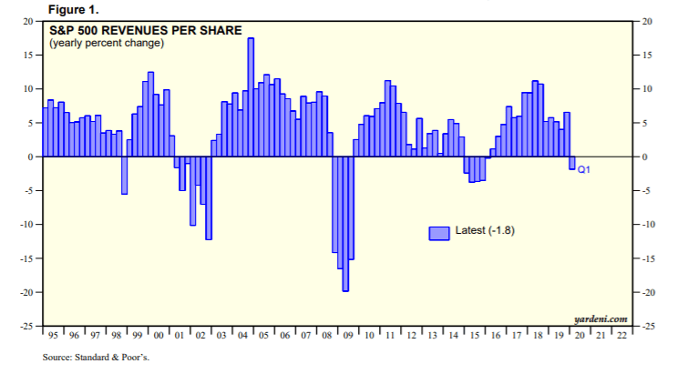
A couple key takeaways from this chart.
Firstly, the growth in revenue peaked at the same time as GDP growth did, unsurprisingly. Secondly, yet again we can see a downwards trend in revenues before Q1 of 2020. Like with all the negative YoY quarters on this data, they were all preceded by an already established downwards trend in growth. Thus proving yet again that these downturns do not come out of nowhere.
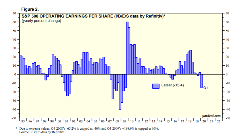
This chart provides an excellent follow-up to the previous example. As the top-line growth of companies decelerated, it makes sense why the earnings growth would also slow. While earnings growth peaked a quarter later, the same downwards trend emerged as with revenue growth. Even before COVID-19 hit the US economy in Q1 of 2020, there had already been a quarter of negative earnings growth in Q3 of 2019.
Corporate Profit Cycle:
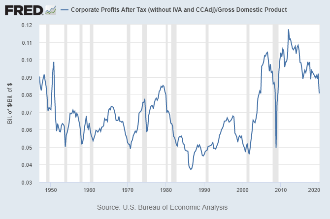
As shown in the previous section, the ~500 companies representing the S&P 500 were experiencing slowing sales and earnings growth. Well, what about US corporations at large? As shown by the data above, US corporations were also experiencing a downwards sloping rate of change in their after tax profits.
US Durable Goods:
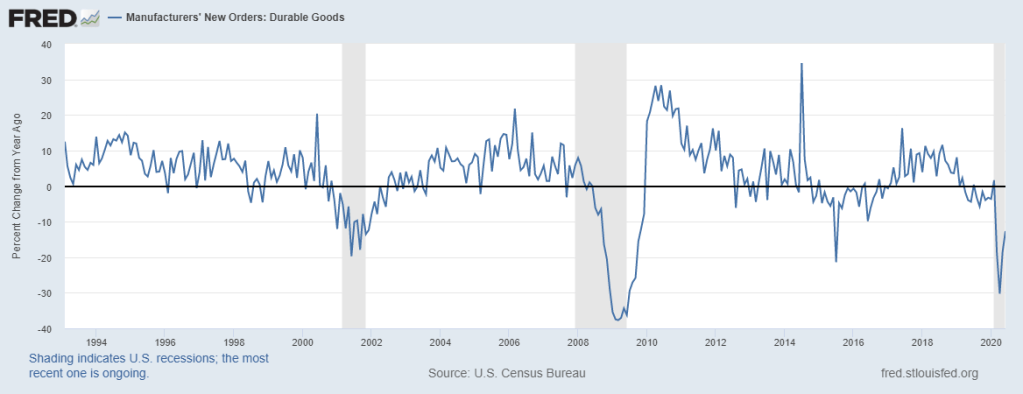
Given the nature of durable goods, which serve longer term purposes for businesses, this data serves as an excellent forward looking indicator for the confidence and outlook of manufacturers on the economy. Although it is not a smooth curve by any means, this data demonstrates a cyclical peak in 2017 that was downwards trending ever since. It even hit a negative mark pre-COVID.
Core Capital Goods Orders:
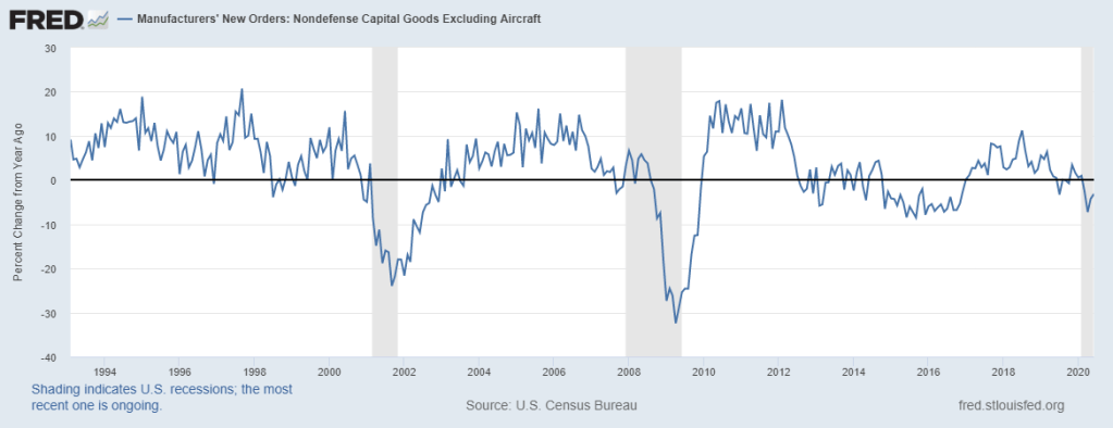
Very similar to durable goods, core capital goods orders are an excellent leading indicator for how confident businesses are, and their desire to expand. Unlike durable goods, this peaked in 2018, but was similarly in a downwards trend pre-COVID.
Kansas City Fed Manufacturing:
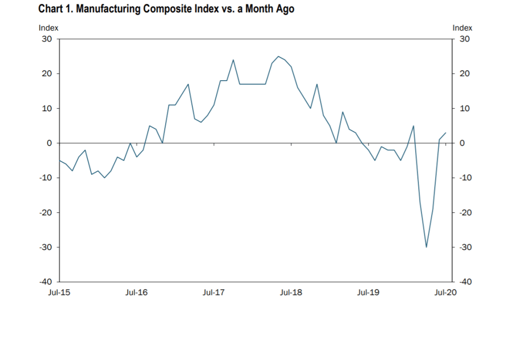
Lastly, this very helpful data from the Kansas City Fed helps to point out yet again how the U.S. economy peaked, in growth terms, around the second quarter of 2018.
This data, unlike durable and capital goods orders, represents a qualitative take on manufacturing. Nonetheless, through a qualitative lens, it still shares insights about the economic outlook that firms have and their plans for expanding. Yet again, a slowing rate of change from mid-2018 raised the probability that this mark would turn negative, which it did almost a year before COVID-19.
Future Works:
After completing this work, I realize that my knowledge on corporate debt, and how to look at debt cycles overall, can improve a lot. As a result, that is something I am going to study much more in depth, and produce a piece on that matter in the future (by the end of 2020 ideally).
Conclusion:
I cannot speak to the reasons why some may claim that the sole culprit or overwhelming factor behind this economic downturn is COVID-19, but I assume that they are likely being prisoners of the moment, and not looking at the underlying economic trends. I used at least one chart for every one of these topics because it is my belief that these economic indicators should be measured and mapped across longer term time frames, in order to understand how they are changing.
With all that being said, it is fair to criticize this piece for its simplicity and perhaps overemphasis on rate of change. The reason why I wrote it this way was because of my overall limited knowledge on many of these topics, but also because I understand how powerful this concept is when looking at economic data.

